Getting started
You can quickly change the overall appearance of the site by modifying the colors available and editable in the Variables/Base collection tab.
Note: The site has been designed with a "Light mode" aesthetic in mind, but of course, you are free to experiment with colors that suit you.
Figma file included with your purchase. Email us with your receipt.
Variables
You can instantly refresh the look and feel of your site by updating fonts and colors within the Variables panel. All core styles are managed through the Base collection for global consistency.
Note: While this template was intentionally crafted with a refined Light Mode aesthetic, you are fully encouraged to experiment with color palettes that best align with your brand identity.
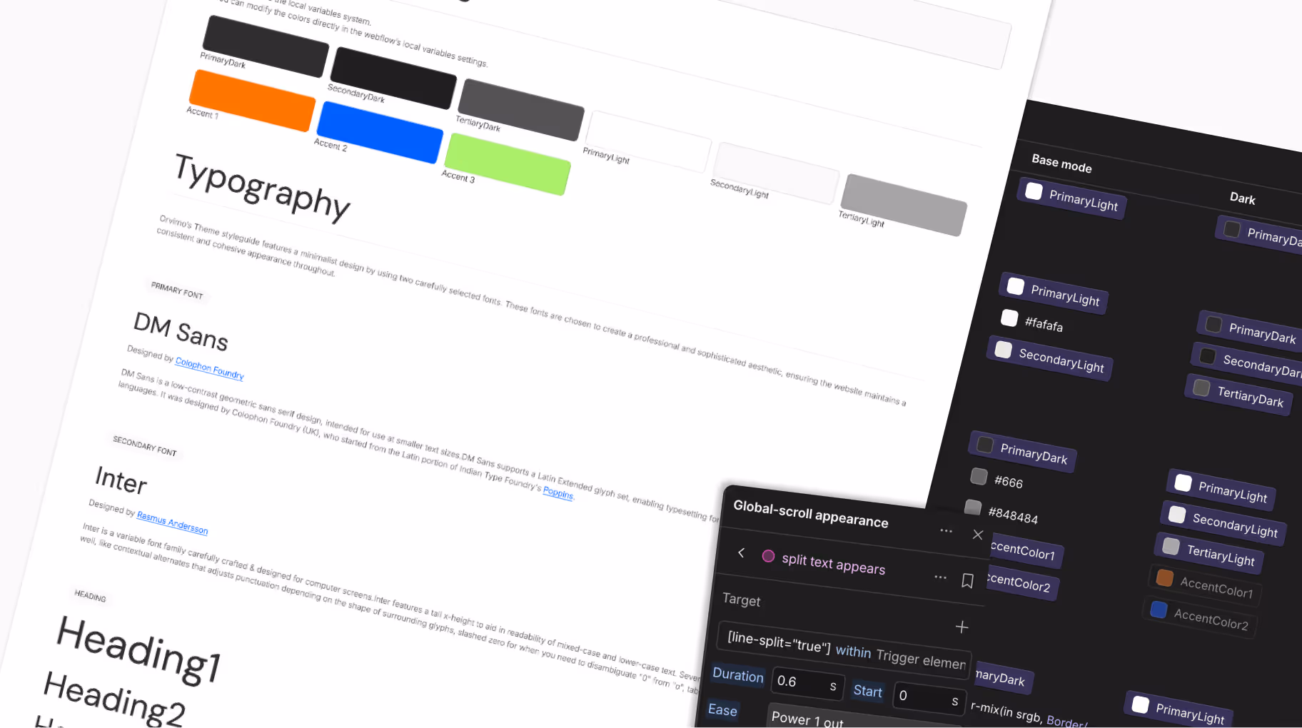
The Base Collection serves as the "Source of Truth" for your site’s fundamental styles. This is where you define your raw brand colors and typography.
Fonts: Update the PrimaryFont and SecondaryFont variables to change typography globally across all pages.
Colors: Replace the raw hex codes for Primary, Secondary, and Accent colors with your own brand palette. These values act as the foundation for the entire theme system.

Beyond colors and typography, the Base Collection centralizes all essential design tokens to ensure a cohesive interface. This is where you manage Radius (corner rounding), FontWeight, IconSize, and Opacity, along with core Spacing values.
By adjusting these variables, you can globally refine the visual DNA of your site—from the sharpness of buttons to the prominence of icons—ensuring a polished and consistent look across every page.
The Size Collection is the structural backbone of your website. It provides a unified system for spacing, typography sizes, and container widths.
Layout Foundations: Variables such as Sitepadding and MaxWidth ensure that your content maintains consistent alignment and optimal readability across all browser widths.

The Size Collection manages core typography scales (XL, L, M, XS) alongside site-wide spacing and padding.
Fluid Typography: To maintain a high-end aesthetic and prevent broken layouts, several font sizes utilize Fluid Scaling (via the CSS clamp() function). This allows typography to scale linearly and smoothly between breakpoints, ensuring perfect proportions on every screen size.
Pro Tip: If you wish to recalculate your own fluid scales, we recommend using an external tool like clamp.font-size.app to generate your custom values.
The Theme handles the intelligent application of colors across your UI. Instead of static values, the template uses
Semantic Variables that automatically adapt based on the active mode (Light or Dark).
Semantic Mapping: Elements are linked to functional names (e.g., BodyBackground). This ensures a consistent UI and allows for effortless theme switching.
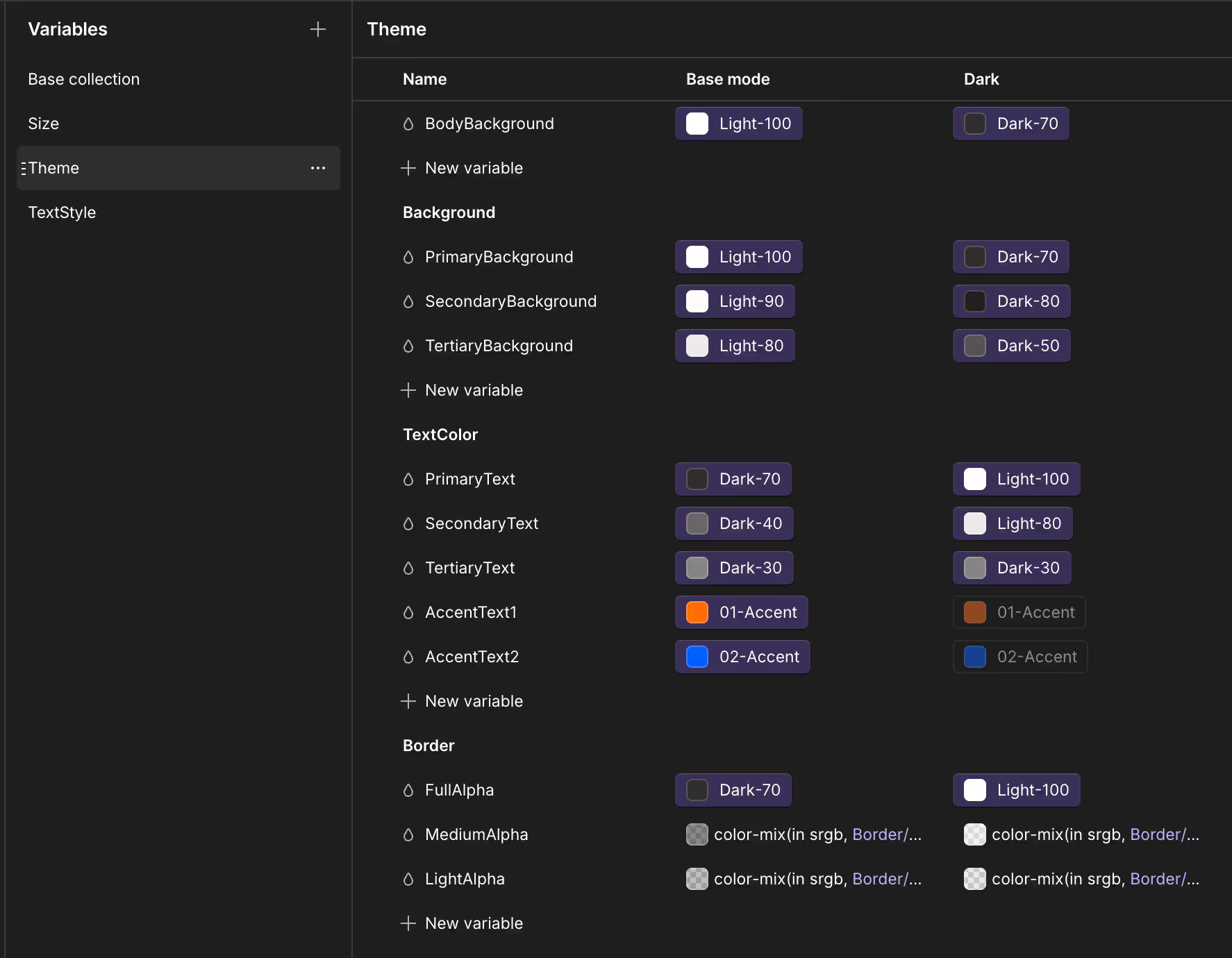
Light & Dark Modes: Each variable is mapped across two modes. You can fine-tune the Dark Mode appearance independently to ensure perfect contrast and readability.
Color-mix (Alpha Channels): Border and divider variables leverage the color-mix function, ensuring sophisticated transparency and depth on any background color.
The TextStyle Collection is where your typography truly comes together. It allows you to combine various global variables into comprehensive, reusable text styles.
Integrated System: This panel bridges your Base Collection (e.g., PrimaryFont) with your Size Collection (e.g., XL, L, Body) to create harmonious typographic sets.

Styleguide
The Style Guide page serves as your visual sandbox. It displays all the template’s core elements—including typography, color palettes, buttons, and forms—allowing you to preview the impact of your variable updates at a glance.It is the perfect tool to ensure your new brand identity remains consistent across all components before launching your site. We recommend keeping this page as a living reference throughout your entire customization process.
ou can review and visualize the real-time results of your variable adjustments directly on the Style Guide page. This page centralizes every UI element, allowing you to instantly validate the harmony of your colors, typography, and components before rolling them out across the entire project.
Gsap Animations
This template leverages the power of GSAP animations, now natively integrated within Webflow. All animations used throughout the site are organized and accessible directly within the Interactions panel.No GSAP coding knowledge is required; every movement and transition can be fully managed and customized through Webflow's visual interface.

The "Global-scroll appearance" animation is implemented across most pages to elegantly reveal typography and layout blocks as they enter the viewport.
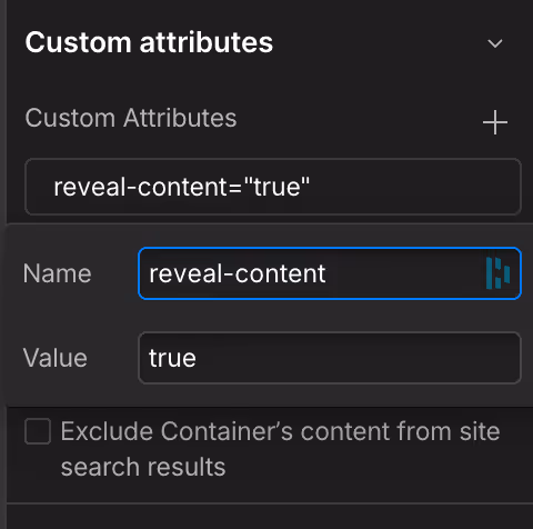
"Global-scroll appearance" utilizes Custom Attributes to trigger these GSAP interactions without manual setup:
reveal-content="true"
line-split="true"
Apply this to text elements for a sophisticated line-by-line reveal.
fade-in="true"
Apply this to divs, images, or blocks for a smooth opacity & light scale transition.


CMS Instructions
This template leverages the Webflow CMS to manage your content dynamically. While most collections are straightforward, the Documentation system includes specific structural nuances designed to ensure a seamless user navigation experience.
The Docs Articles collection houses the individual pages of your documentation. Each article must be linked to a category to be correctly indexed in the sidebar.
Sorting: You have the flexibility to set a custom sort order for how articles appear within their respective category pages.

Content Fields: You can define the title, a short summary, the rich text body, and a main hero image.
Categorization: Every article must be assigned to a category, which represents Level 1 of your navigation.
Rich Text & Code Snippets: The Rich Text field fully supports Code Snippet integration. This allows you to embed technical examples directly within your articles, ensuring a clean and readable format for your users.

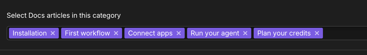
The Docs Categories collection acts as the structural backbone for your documentation's sidebar navigation (excluding "Contact Support" and "Change Log").

Configuration: Manage the category name, short description, rich-text, navigation order, and specific imagery (homepage thumbnails and category header images).
Navigation Order (Level 1): To organize the categories in the sidebar, use the "Order" field. The sorting follows a simple numerical logic: the lower the number, the higher the category will appear in the list (e.g., "1" will be the first item displayed).
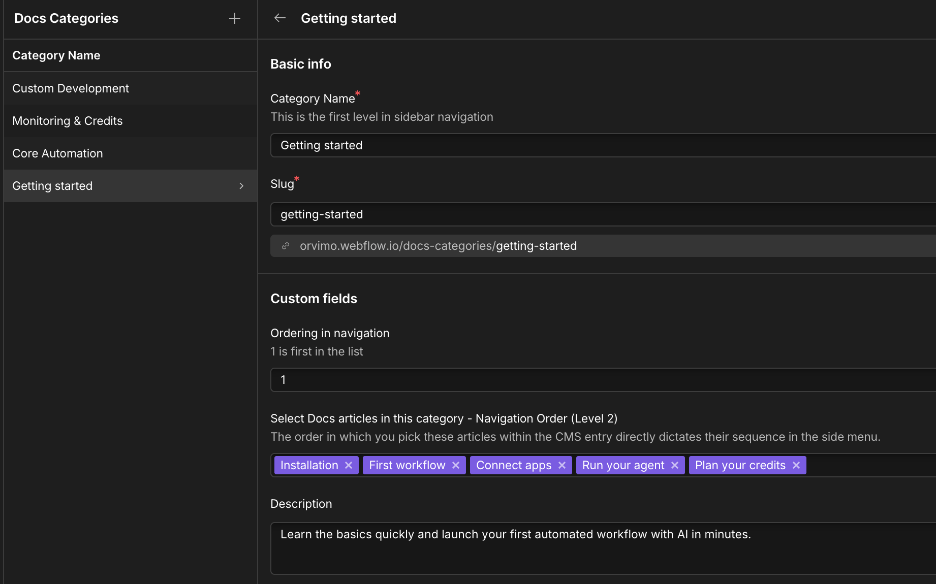
Navigation Order (Level 2): You must manually select which articles appear as Level 2 items in the sidebar when that category is active. The order in which you pick these articles within the CMS entry directly dictates their sequence in the side menu.